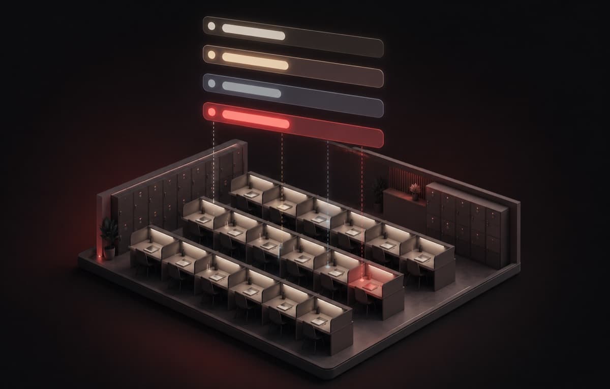
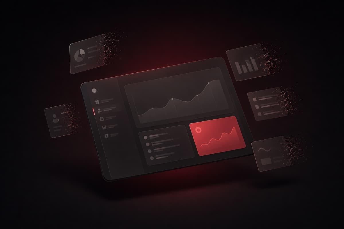
Every feature you add to a dashboard is a tax on the person who has to look at it every morning. We stopped building and started subtracting.
The dashboard nobody asked for
When we shipped Brightgoal's first owner dashboard, we did what most product teams do: we looked at everything owners might conceivably want to know, and we gave it to them. Revenue graph for the month. Revenue graph for the year. Seat occupancy chart. Locker occupancy chart. A dues widget sorted by amount. A dues widget sorted by urgency. Today's check-ins. Yesterday's check-ins. A renewals-due table. A recently-added-students table. Two tabs for reports. One tab for analytics. One summary card per slot. The whole thing.
It felt complete. It felt thorough. It felt, if we're being honest, like we were proud of ourselves.
Three months later, a library owner in Gorakhpur told us during a support call that he only ever looks at three things: how many seats are occupied right now, who owes him money, and who's coming in today. Everything else, he said, he either already knows in his head or doesn't need until something goes wrong.
We smiled politely and kept building new widgets for another six weeks.
What the data actually said
We started tracking click events on every dashboard element. Not pageviews — actual interactions. Hovers, expands, table scrolls, tab switches. After eight weeks across forty-one active libraries in Uttar Pradesh, the picture was stark.
Three widgets accounted for 71% of all interactions: the occupancy summary (how full are my seats right now), the dues list (who owes money and how much), and today's check-ins (who's actually here). Everything else — the charts, the analytics tabs, the year-over-year revenue panel, the slot-by-slot breakdown table — together accounted for the remaining 29%, and much of that was accidental hovers from owners scrolling past.
The two report tabs had a combined weekly active rate of 4.3%. Not 4.3% click-through — 4.3% of library owners opened either of those tabs at all in any given week. The analytics tab, which we had spent two weeks building, was used by exactly six owners more than once. The rest opened it once out of curiosity and never returned.
The yearly revenue graph — the one that looks impressive in screenshots — was interacted with by fewer owners than our error logging captured opening the browser dev tools by accident.
The psychology of a cluttered dashboard
Before we touch the specifics of what we cut, it's worth naming what clutter actually does to the person looking at a screen.
Hick's Law is usually cited in the context of menus and form fields — the more choices you give someone, the longer it takes them to decide. But it applies with equal force to dashboards. A dashboard with fourteen widgets is not a dashboard with fourteen options; it's a dashboard that forces the owner to perform fourteen micro-decisions every time they look at it. Do I need to look at this? What does this number mean today? Has this changed? Should I be worried? Each question costs attention. Attention is finite. By the time an owner has processed six widgets they don't need, they're already slightly depleted when they reach the three they actually use.
Attention residue is a concept from Sophie Leroy's workplace psychology research. When you glance at something — even briefly, even when you decide it doesn't matter — a fragment of cognitive processing remains on it. The widget you didn't click on still charged you something. A dashboard full of widgets you never act on is a machine for generating attention residue ten or fifteen times a morning, before the workday has properly begun.
The paradox of choice works the same way at the widget level. Give someone more information and they feel less capable of acting, not more. Library owners we interviewed described the old dashboard as making them feel like "something was probably wrong somewhere, I just couldn't find it." That ambient unease came not from any actual problem — it came from the sheer amount of surface area demanding scanning.
The irony: we had built a dashboard full of information to help owners feel in control, and instead made them feel vaguely overwhelmed every morning.
I open the dashboard to see if everything is okay. The old one always made me feel like I was missing something. The new one just tells me we're fine.
The decision framework: how we decided what to cut
Removing features feels risky. There's always a voice in the room that says "but what about the one user who needs that?" — and that voice, if you let it, will preserve every widget forever while the product gets slower and harder to read each release.
We needed a framework that was honest about tradeoffs rather than sentimental about features. We landed on three questions:
- 1
Does fewer than 15% of owners interact with this in a typical week?
If a feature's weekly active rate is below 15%, it is not a dashboard feature. It might be a report, a settings page, or a detail view — but it does not belong on the primary screen that opens every morning. We applied this threshold without exceptions.
- 2
Can the owner get this information another way, faster?
Some low-usage widgets weren't useless — owners just got the same information more efficiently elsewhere. The slot-by-slot breakdown, for example, was superseded by glancing at the seats tab. Keeping it on the dashboard created redundancy without adding speed.
- 3
Does removing it break any workflow we can't replicate elsewhere?
This was the safety check. Before cutting anything, we traced the full workflow: what decision does this widget support, and where else in the product can that decision be made? If there was no other path, we moved the feature rather than deleted it. Nothing got deleted without a home.
Every widget, every tab, every chart went through these three questions. The ones that survived all three stayed. The ones that failed the first question and had no unique workflow answer were removed.
What we cut, and why
- The yearly revenue graph. Used by under 5% of owners weekly. Revenue over time is genuinely useful — in the billing history section, where owners already go when they need it. On the dashboard it was decoration that added a full charting library to the bundle.
- The monthly revenue graph. Same story. Owners know what they charged this month because they enrolled the students. A graph of it doesn't add a decision they couldn't already make. Removed.
- The locker occupancy chart. Lockers are secondary inventory. No owner told us they started their morning thinking about locker fill rates. The number that matters — how many lockers are free — lives in the lockers tab in two seconds flat.
- The slot-by-slot breakdown table. This duplicated the slots tab. It loaded a separate query. It added four hundred milliseconds to the initial render. Gone.
- Yesterday's check-ins widget. Yesterday is over. If there was a problem yesterday, the owner already knows. If they don't know, they need the student detail view, not a summary count. We kept today's check-ins and removed the historical one.
- The recently-added students table. This was useful exactly once: when an owner had just added a student and wanted to confirm the record was there. That confirmation now happens in the success state of the add-student popup. The widget was a patch for a missing UI feedback loop, not a feature.
- The dues widget sorted by amount. We had two dues widgets — one sorted by amount owed, one sorted by urgency (days overdue). Owners only ever used one sorting order. We asked ten owners which one they'd keep if they could only have one. Nine said urgency. We kept urgency.
- The renewals-due table. This lived on the dashboard and also had its own section in the students tab. Two sources of the same data. We kept the students tab version, which is more actionable, and removed the dashboard duplicate.
- The analytics tab (full removal). Eleven widgets. 4.3% weekly active rate. We built a separate lightweight analytics section that owners reach when they explicitly want to dig into numbers — not something that loads every time the dashboard opens.
- The reports tab (full removal). Same logic. Reports are pull-based by nature — you go get them when you need them. We moved the two actually-used report types (payment history export, student roster export) to the billing and students tabs respectively, where they're contextually relevant.
- The year-over-year comparison panel. A feature we built because it looked good in a product demo. Not one owner in our interview cohort mentioned it unprompted. Not one. Cut.
Before and after
- Today's occupancy — one number, instantly readable
- Dues list sorted by urgency — act on it or dismiss it
- Today's check-ins — who's here, at a glance
- Loads in under 800ms on a 4G connection
- Zero decisions required before you reach what matters
- Revenue graph (monthly) — decorative
- Revenue graph (yearly) — decorative
- Locker occupancy chart — rarely consulted
- Slot breakdown table — duplicated the slots tab
- Yesterday's check-ins — historical, not actionable
- Recently-added students — patch for missing feedback
- Two dues widgets with different sorts
- Renewals table — duplicated the students tab
- Analytics tab — 4.3% weekly active rate
- Reports tab — rarely used, wrong location
- Year-over-year panel — demo vanity
- Loads took 2.1s median on 4G
The bundle: what removing two charting libraries and an analytics engine looks like
We were carrying three dependencies that existed purely to support low-usage widgets: a charting library for the revenue graphs, a second charting library for the occupancy donut, and the analytics engine that powered the tab we cut. Together they accounted for the majority of the JavaScript reduction.
$ npx brightgoal build --analyze→ analyzing bundle…BEFORE (v2.1.4)Page: /dashboardFirst Load JS: 487 kB└ chunks/recharts.js 141 kB└ chunks/victory-charts.js 89 kB└ chunks/analytics-engine.js 76 kB└ chunks/dashboard-widgets.js 48 kB└ chunks/framework.js 133 kBAFTER (v2.2.0)Page: /dashboardFirst Load JS: 301 kB└ chunks/dashboard-widgets.js 38 kB└ chunks/framework.js 133 kB└ chunks/shared.js 130 kB✓ Bundle reduced by 186 kB (38.2%)✓ Charting dependencies removed: 2✓ Analytics engine: removed from critical path✓ Median dashboard load (4G): 2100ms → 780ms
The 38% reduction is not a rounding victory — it changes the qualitative experience on the connections most library owners in UP are actually using. Sub-800ms loads on a 4G connection feel instant in a way that 2.1 seconds simply do not, regardless of what the spinner looks like.
What we kept, and why those three things survived
It's worth being explicit about why the three surviving core widgets passed our framework.
Occupancy is the single most important number in a library's day. If occupancy is low, the owner's whole morning shifts — they think about marketing, about pricing, about whether a particular slot is worth running. If it's high, they relax. The entire emotional tenor of the workday starts here. It earns its position.
Dues is the cash flow question. In a business that runs on monthly fees, who owes you money and how overdue they are is an operational priority every single day. The widget surfaces the highest-urgency cases immediately. Owners told us they make an average of two to four direct calls to students within the first hour of opening the dashboard. That widget drives revenue recovery that shows up directly in the numbers.
Today's check-ins tells the owner who is physically in the building right now. For libraries with staff, it's the briefing tool. For solo operators, it's the safety check — who did I expect and who actually showed up. It's also the source of the day's first real-time signal: if check-ins are unusually low by mid-morning, something is wrong and it's early enough to do something about it.
Three widgets. Each one irreplaceable. Each one drives a different type of daily decision. None of them decorative.
A dashboard is not a collection of everything you might need.
It is the shortest possible path from opening the app to knowing what requires your attention today. Every widget that doesn't serve that path is a tax on the ones that do.
What we learned about subtracting
Removing features is technically easier than building them. The code comes out, the tests go green, the bundle shrinks. But it is psychologically much harder, because every removal feels like a statement that you were wrong to build it in the first place.
The framing that helped us was this: features are not failures because they get removed. They're failures if they stay when they shouldn't. The analytics tab was worth building — we learned from the low usage data that owners don't want analytics pushed at them on their primary screen, which informed how we designed the pull-based analytics section. That knowledge was worth the build. Keeping the tab after learning that would have been the waste.
The same applies to the revenue graphs. Building them taught us that owners have an intuitive grasp of their own revenue that a graph doesn't improve — they enrolled those students, they know what they charged. The graph was confirming information the owner already held. That's a fine thing to confirm once; it's not something worth loading on every dashboard open for the rest of the product's life.
Every feature request is a hypothesis. Some hypotheses are confirmed, some are falsified, some are confirmed but at the wrong scope (right information, wrong location). None of them should become permanent fixtures without evidence that they're earning their place every day.
The evidence in our case was clear. Three widgets earned their place. Eleven didn't.
The best dashboard is the smallest one that answers today's questions.
Less to scan. Less to load. Less to maintain. More time for the work that actually matters.